

21Shares
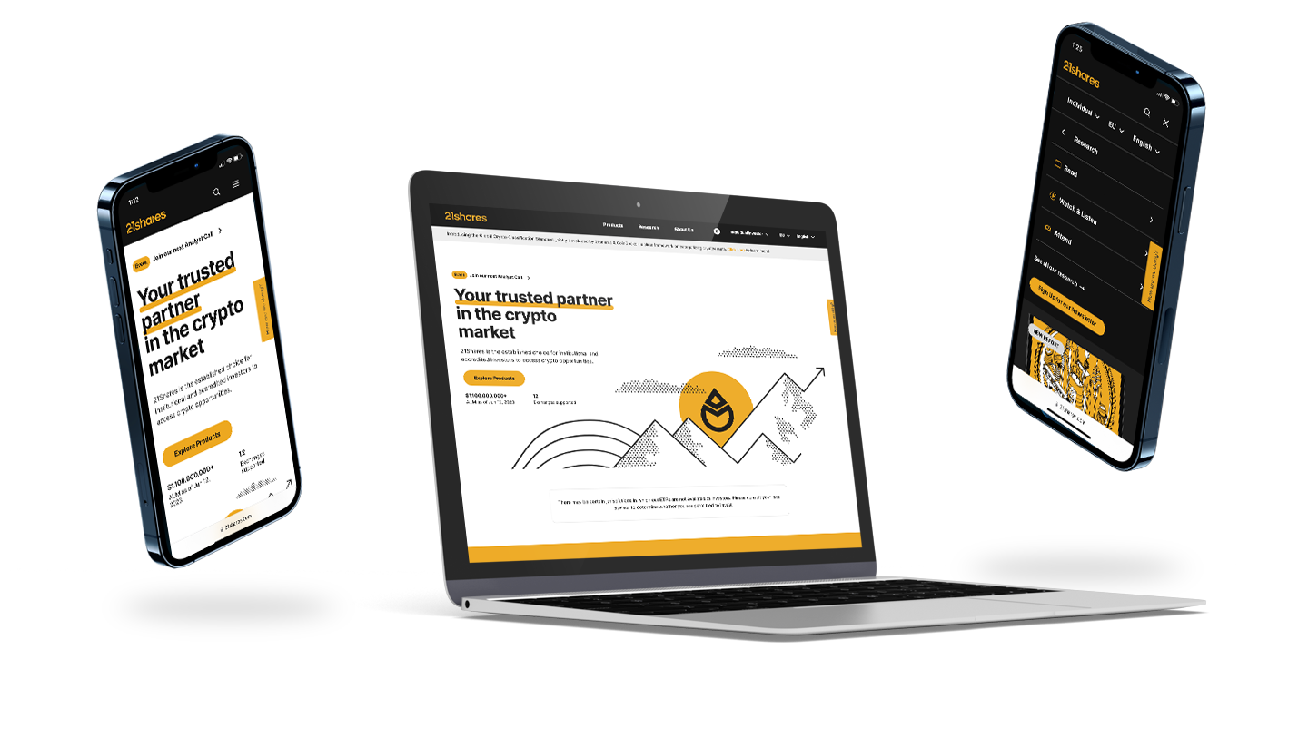
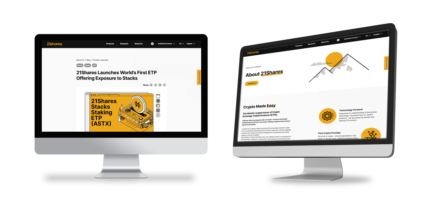
At 21.co, I led the product design for the successful rebranding of the 21Shares website. Taking charge of UX, UI, and user journey aspects, I introduced innovative best practices that elevated our online presence. Collaborating with cross-functional teams, we delivered a remarkable website that resonated with users, positioning 21Shares as an industry leader.

The redesign
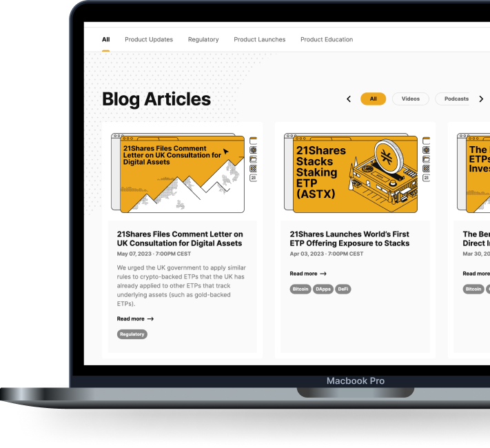
As the lead designer, I spearheaded a comprehensive website asset redesign, including the entire design system library, using Figma with auto layout functionality. By leveraging this approach, I empowered all designers to access and modify components as needed, without necessitating fundamental changes. This not only streamlined the design process but also granted me greater control over the output and allowed for effective oversight of the overall design direction.


the process
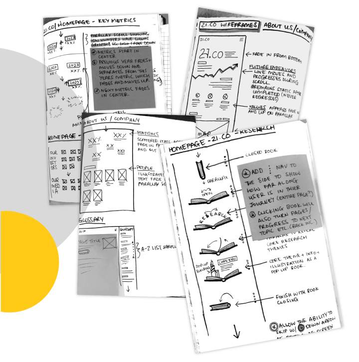
Throughout my design process, I began with sketching and embarked on multiple rounds of iterations, closely involving key stakeholders. Extensive research played a pivotal role, enabling me to gain a profound understanding of the users' needs and aspirations, ultimately leading to the creation of an exceptional product.
My research encompassed a wide range of activities, including UI/UX comparative analysis, which helped identify industry best practices and benchmark our project against them. Additionally, I delved into content blocking for layout, which significantly influenced the initial brainstorming phase and, collectively, contributed to the shaping of our project roadmap.
By combining these meticulous research efforts with iterative design methods, I ensured that the final product resonated with users, met stakeholder expectations, and exceeded project goals.


©2024 Edwina McGregor